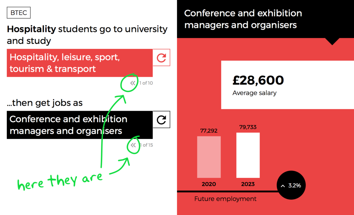
With our latest release of Pathways we have introduced a small back button into the Career and HE selectors. Feedback from colleges highlighted the need to move back as well as forward, so we listened and made it happen.
Whilst it might seem like a minor addition, our latest update to Pathways introduces a small back button.

It is always our aim within Pathways to make things easy to use and for the tool to highlight future jobs that you may not have thought of. For it to be a discovery tool.
Which is why we like the idea of the refresh button to cycle through different career and HE options.
However we also understand that when you’re cycling through over 25 different jobs, you might skip past a job by mistake.
Feedback from a few colleges suggested a user’s experience would be improved if they could have a bit more control over how they navigate between careers or HE options.
We listened to feedback and looked at a few ways how we could achieve this.
Drop downs
A common suggestion was to utilise a drop down menu instead of the current selectors, however we need to be aware that the component we present must be easy to use across all types of devices - and a drop down menu on mobile screens becomes quite cumbersome when containing over 15 options.
Furthermore, research shows that drop down menus aren’t great for accessibility where they can become frustrating for someone with poor visibility or reduced motor skills.
A simple back button
We tested a variety of components and button types. Our primary aim was to maintain an interface that felt lightweight and easy too use whilst giving a little more control over to the user.
We wanted to maintain the focus on discoverability and stepping forward, which we feel is achieved by the current refresh button. Yet give someone the option to step back.
With the introduction of this little back button, hopefully the user now feels more in control of how they progress through the various options.
See what you think and let us know!


