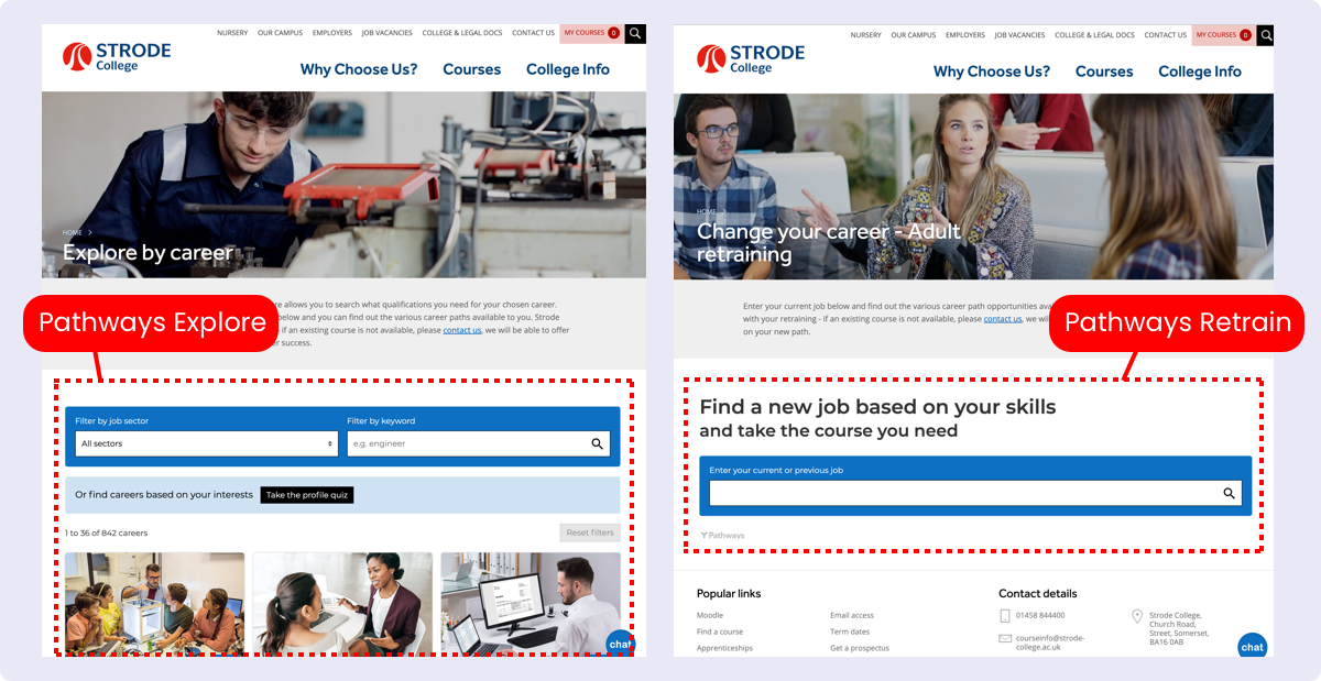
Many colleges love the concept of Explore and Retrain but ask how best they should be incorporating them into their websites. As a result we created this case study using Strode College as an example of best practice for using these tools.
As we know, students choose courses in many different ways - some knowing exactly what they want to study whilst others needing a bit more hand holding. With this in mind, we created Pathways Explore and Retrain to enable potential students to search for courses on your website by taking a careers first approach when deciding on which courses they should take. Both tools allow students to find careers they might be interested in and see how those careers are linked to the courses you offer.
When adding these tools to your website, the first thing to mention is that we would highly recommend you create a full width individual page on your site specifically to house each of these tools, rather than trying to fit them in amongst other content on a page. It's entirely up to you where this page resides in your website structure and it maybe something you would want to discuss with your web developer.

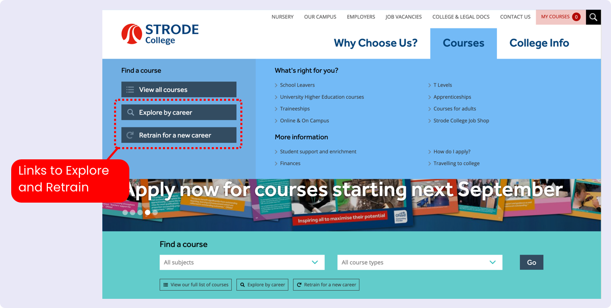
Next you need to think about how to signpost users to access the tools. We would suggest that you engage early in the user journey as the first thing the majority of your users will be doing is searching for courses. On the Strode College website, they have added links from the homepage directly under the course search bar.

Obviously once the user has left the homepage, you also need another way for them to navigate to Explore and Retrain. You could create signposting links on relevant pages and sections of your website, but also you may want to add them to your main navigation. On the Strode College website we can see that they have added links to the ‘courses’ section dropdown navigation.

Although of course it's entirely up to you how you choose to embed these two tools, the purpose of this case study is to give an example of how another college has integrated the tools into its website's user journey.


